
Ignoring a Clear First Impression
Your website is often the first encounter a potential client has with your brand — and in the design world, first impressions are everything. Visitors form an opinion within seconds, deciding whether to explore further or leave.
A strong homepage should immediately communicate your style, expertise, and professionalism. Lead with a high-quality hero image that reflects your signature work. Pair it with a concise headline that clearly states who you are and what you offer, without jargon or ambiguity.
Keep the layout clean, with balanced white space that allows your portfolio to stand out. Ensure branding elements — color palette, typography, and logo — align with your design aesthetic.
If your homepage feels cluttered, outdated, or unclear, you risk losing the trust and interest of potential clients before they’ve even seen your work. A well-crafted first impression not only captures attention but also sets the tone for the entire client experience.
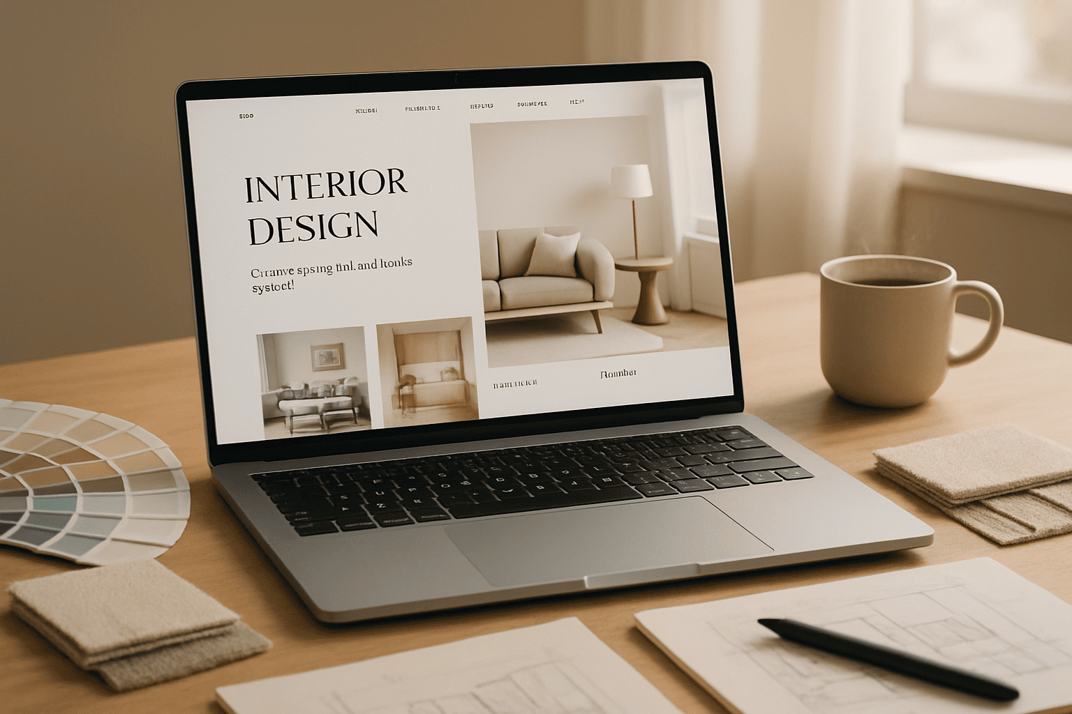
Overloading with Too Many Visuals
As an interior designer, visuals are your strongest asset — but too much of a good thing can work against you. When every inch of your website is filled with images, visitors can feel overwhelmed and unsure where to focus. Instead of being impressed, they may leave without truly appreciating your work.
The key is curation, not clutter. Feature only your best, most representative projects, and give each image room to breathe. Use a clean, minimal layout that guides the eye naturally from one section to the next.
High-quality photography is more impactful when it’s paired with short, clear descriptions that provide context — such as the style, location, or design challenge. This not only makes your portfolio easier to browse but also helps potential clients connect with your process.
Remember: the goal isn’t to show everything you’ve ever done. It’s to show just enough to spark interest and make visitors want to learn more.
Cluttered Navigation Menus
Think of your website’s navigation menu like the floor plan of a home — if it’s cramped, confusing, or overcrowded, visitors won’t know where to go next. A cluttered menu with too many options can make people feel lost before they’ve even started exploring.
Instead, keep it clean and purposeful. Stick to essential links — Home, Portfolio, About, Services, Contact — and group related pages under clear categories. This way, visitors can quickly find what they’re looking for without wading through a sea of tabs.
Use short, straightforward labels (no fancy terms that only you understand) and arrange items in a logical order. Your goal is to guide, not overwhelm.
A well-structured menu makes your website feel polished, professional, and easy to navigate — which instantly improves the overall user experience and keeps potential clients engaged longer.
Not Showcasing a Strong Portfolio
For an interior designer, your portfolio is more than a collection of images — it’s proof of your talent, style, and ability to deliver results. If your website hides it behind too many clicks, shows outdated work, or presents images in poor quality, you’re missing your biggest opportunity to impress.
A strong portfolio should be easy to find from the homepage and instantly draw visitors in. Select only your best projects — the ones that truly represent your signature style and versatility. Each project should have high-resolution images, a brief description of the concept, and key details like location, style, and design challenges.
Organize your portfolio so it’s effortless to browse, whether by style, room type, or project size. Keep the layout clean, letting the visuals speak without unnecessary clutter.
Your portfolio isn’t just decoration — it’s the heart of your brand online. When presented well, it turns casual browsers into serious inquiries.
Weak Mobile Optimization
More than half of your visitors are likely viewing your website on a phone or tablet. If your site isn’t mobile-friendly, you’re instantly creating a poor experience for most of your audience. Slow load times, awkward layouts, and text that’s too small to read will drive potential clients away before they even see your work.
A well-optimized mobile site should load quickly, adjust perfectly to any screen size, and keep navigation simple. Your images should be compressed for speed without losing quality, and buttons should be large enough to tap easily.
Test your site regularly on different devices to spot issues before your visitors do. Remember — mobile users are often on the go, with little patience for a clunky interface.
Strong mobile optimization not only improves user experience but also boosts your search engine ranking, making it easier for new clients to discover you.
Hard-to-Find Contact Information
If a potential client likes your work but can’t figure out how to contact you within seconds, you’ve already lost them. Your contact details shouldn’t be a scavenger hunt — they should be front and center.
Place your contact link in the main navigation, add it to your footer, and consider a small “Contact” button in your header for easy access. Include multiple options — a simple form, your email address, and a phone number — so visitors can choose what works best for them.
For service-based businesses like interior design, quick communication builds trust. Adding a short, friendly message such as “Let’s talk about your project” can make your contact page feel more inviting.
The easier you make it for people to reach you, the faster casual interest can turn into real opportunities.
Poor Use of Color and Typography
Colors and fonts aren’t just pretty details — they speak volumes about your brand and set the mood for your entire website. Using the wrong colors or hard-to-read fonts can confuse visitors or make your site look unprofessional.
For interior designers, your color palette should reflect your style and create a welcoming vibe. Stick to a limited set of colors that complement your work and avoid clashing or overly bright shades that distract.
Typography matters just as much. Choose clean, easy-to-read fonts with clear hierarchy — think bigger headlines, simpler body text, and enough spacing to avoid crowding. Fancy or tiny fonts might look cool but can make reading a chore.
When color and typography work together smoothly, your website feels polished and trustworthy. It guides visitors effortlessly, making them want to stay and explore your designs.
Keep it simple, stylish, and consistent — that’s the secret to making your website look like a true reflection of your talent.
Neglecting Calls-to-Action
Your website might look stunning, but if visitors don’t know what to do next, all that beauty won’t turn into business. Calls-to-action (CTAs) are the gentle nudges that guide potential clients toward reaching out, booking a consultation, or exploring your portfolio deeper.
Keep your CTAs clear, simple, and visible — think buttons like “See Our Work,” “Get a Quote,” or “Let’s Talk.” Avoid vague phrases that leave visitors guessing. Place CTAs strategically: on your homepage, portfolio pages, and contact section so visitors always have an easy next step.
Remember, CTAs aren’t about being pushy; they’re about making it effortless for someone to take the leap from browsing to connecting. Missing or weak CTAs means missed opportunities.
Strong CTAs help turn visitors into clients by creating a smooth, natural flow through your site — making sure no one leaves without knowing how to get in touch.
Skipping Regular Updates
A website isn’t a one-and-done project — it’s a living, breathing extension of your brand. Skipping regular updates can make your site feel stale, outdated, and even unreliable. Visitors notice when your portfolio hasn’t changed in years or your blog hasn’t seen a new post in ages.
Keeping your website fresh means adding new projects, updating your services, and making sure all information is accurate. Regular updates also help with SEO, making it easier for potential clients to find you online.
Even small tweaks — like refreshing images, updating testimonials, or tweaking your design — show you’re active and engaged. It builds trust and keeps visitors coming back to see what’s new.
Don’t let your website fall behind. Treat it like your digital showroom that evolves with your style and skills. Stay fresh, stay relevant, and keep winning clients.
Conclusion
Your website is more than just a digital brochure — it’s the heart of your brand, your online studio, and your most powerful tool to attract and win clients. Avoiding common design mistakes like unclear first impressions, cluttered navigation, or poor mobile optimization can make all the difference between visitors who stay and explore, and those who leave without a second thought.
Keep your site simple, purposeful, and visually balanced. Show off your best work with a strong portfolio, use colors and fonts that speak to your style, and make sure every visitor knows exactly how to reach you. Don’t forget to keep your content fresh and calls-to-action clear — these small details build trust and encourage action.
By focusing on these essentials, you’re not just creating a website — you’re crafting an experience that reflects your talent and professionalism. And that’s how you turn browsers into loyal clients, project by project.
Your design journey doesn’t stop here. Keep refining, updating, and perfecting your online presence — because in the world of interior design, how you present yourself matters just as much as the spaces you create.
